Small details.
Distinctly yours.

Animated React components with a visual point of view. Find one you like, copy the source, and take it further.

Selected components

Find your
next direction.

Browse components

Frequently asked questions

Can I use RicoUI in commercial projects?

Yes. RicoUI’s own code is available under the MIT License. Keep the copyright and license notice when using or sharing it. Third-party code, fonts, and other assets retain their own licenses; check their notices and each template’s repository.

What does my project need?

React and Tailwind CSS 4. You do not need shadcn/ui. Any extra packages a component needs are listed under Dependencies in its Component information panel.

How do I add a component?

Copy the command from the install bar below its preview, or use Show source code to copy the files manually. The Docs walk you through both options.

Can I change the colors and motion?

Yes. Edit the source in your project or use the component’s props. Preview controls let you try settings; those changes are not saved into the source you copy or install.

Will every component adapt to light and dark mode?

Not every component switches themes automatically. Some effects have a fixed palette or background. Check the preview and available props for the look you need.

Still making little things worth sharing.
New designs are on the way.

Follow on X
HomeAn independent collection of thoughtful React components.
All componentsExplore the collection. Preview, customize, and copy.
TemplatesAstro website templates for portfolios, products, and personal projects.
Brand assetsDownload RicoUI logos and artwork as PNG files.
GitHub RepoA tactile repository card with a blue clasp, vector Octocat badge, warm halftone star button, and layered contact shadows.
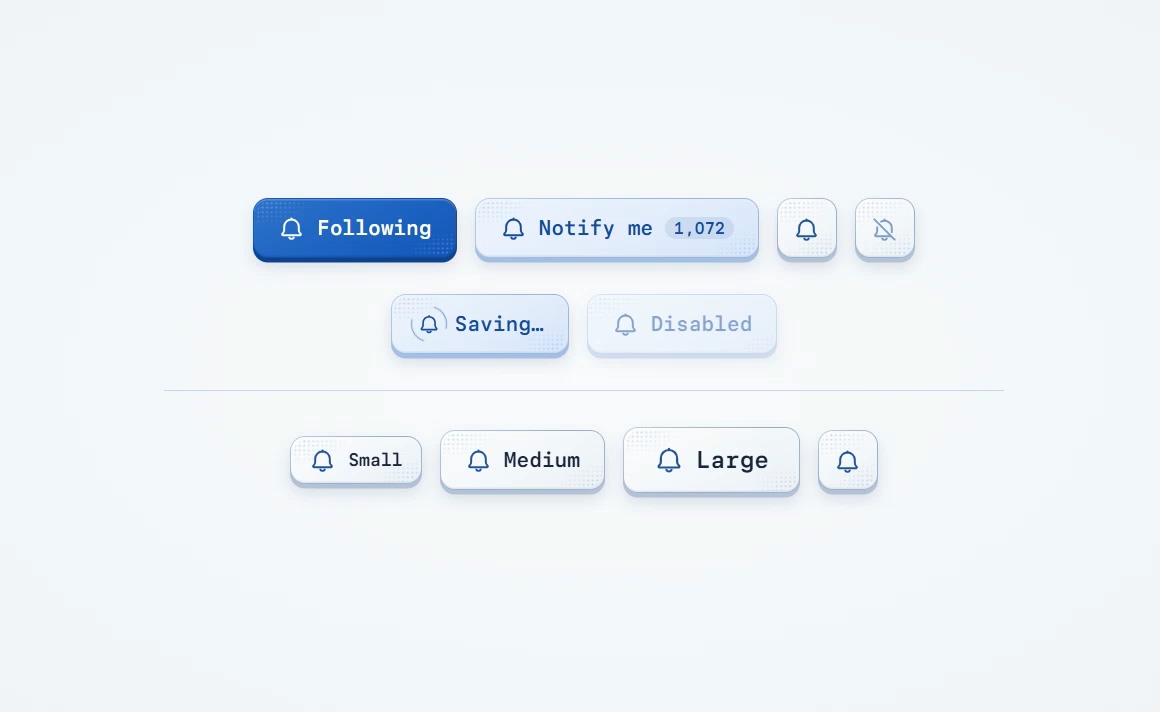
Bell ButtonA notification button with a bell, optional count badge, and the beveled light and dark finishes of RicoUI Button.
ButtonA native button in the RicoUI palette, with light and dark themes, six variants, and built-in loading and disabled states.
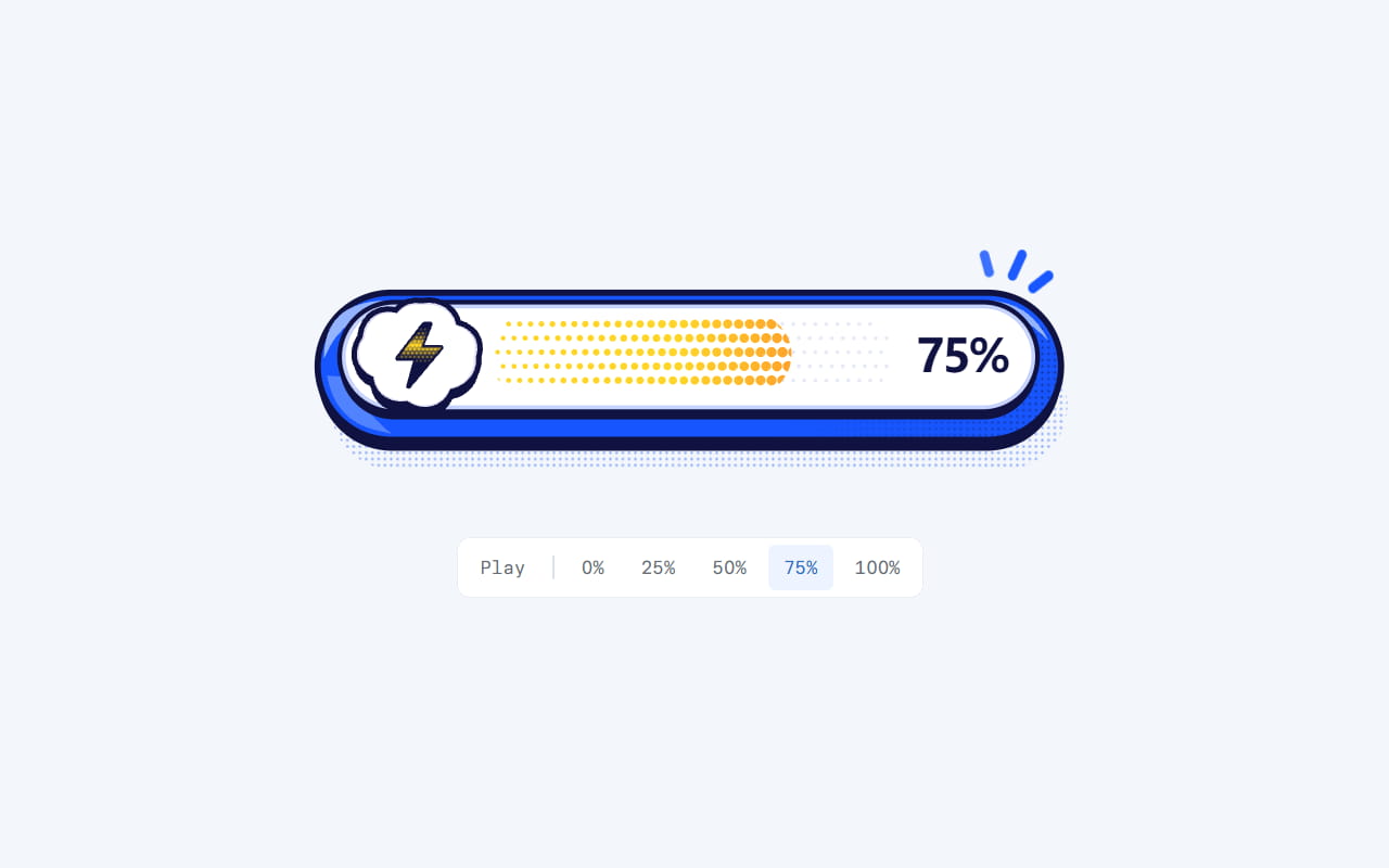
Dither ProgressA horizontal Dither Pop progress bar with a blue capsule, lightning badge and warm halftone fill that grows denser as progress advances.
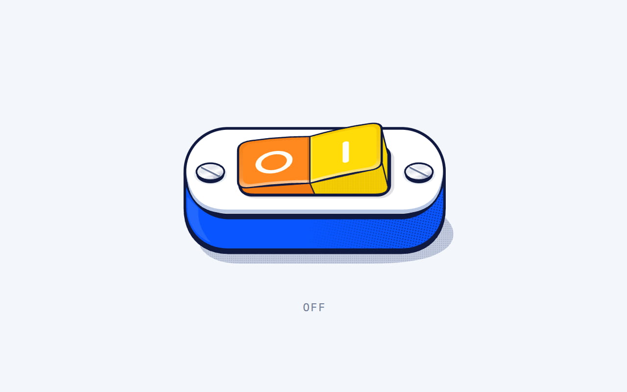
Flip SwitchA horizontal Dither Pop rocker switch with a blue housing, warm two-tone paddle and fine halftone details.
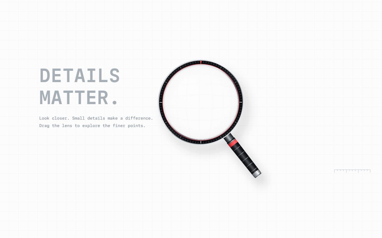
MagnifierA precision optical magnifier with a projected metal housing, inertial drag and a curved magnifying lens.
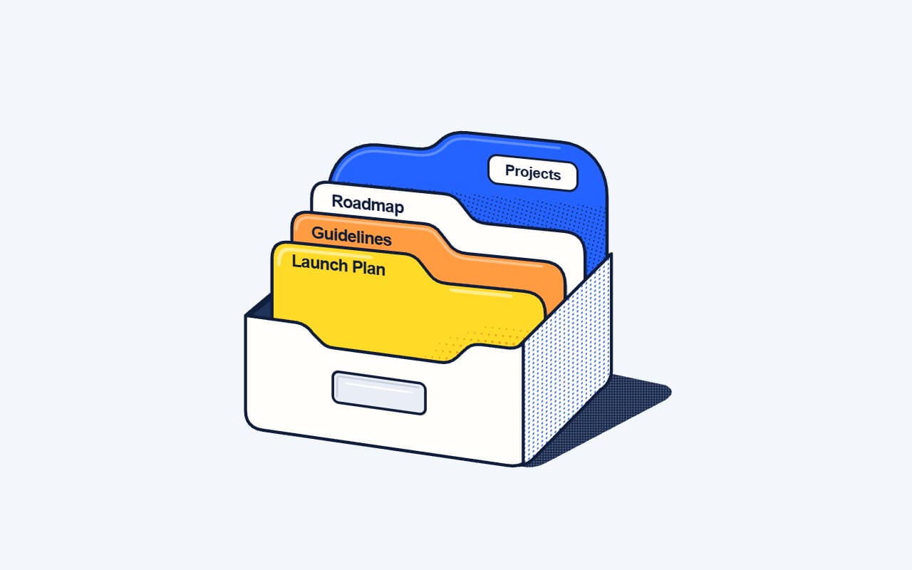
File OrganizerA colorful desktop file box with layered folders, crisp halftone surfaces and a staggered opening sequence.
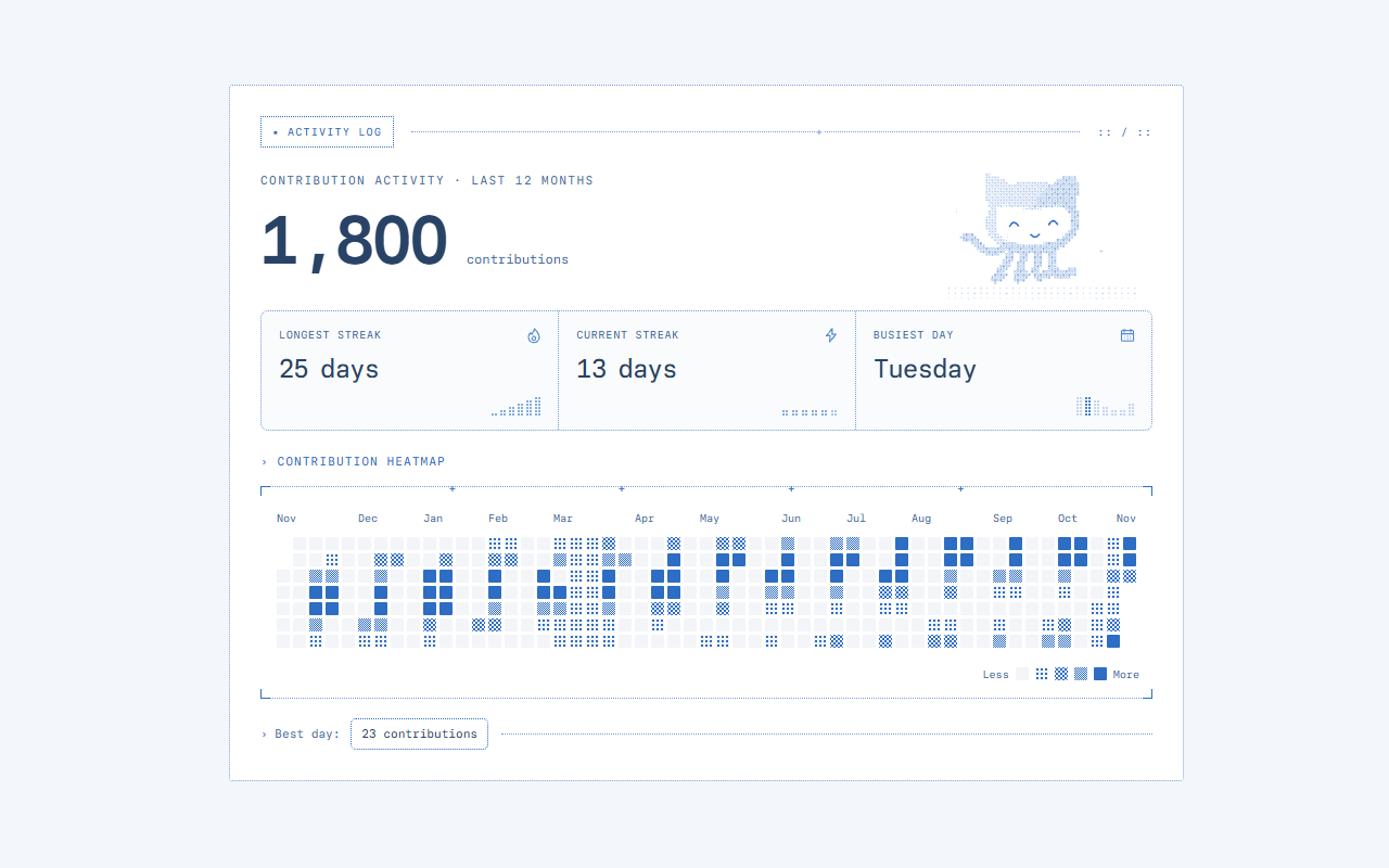
Contribution GraphA five-level blue contribution heatmap with ASCII details and an interactive canvas companion.
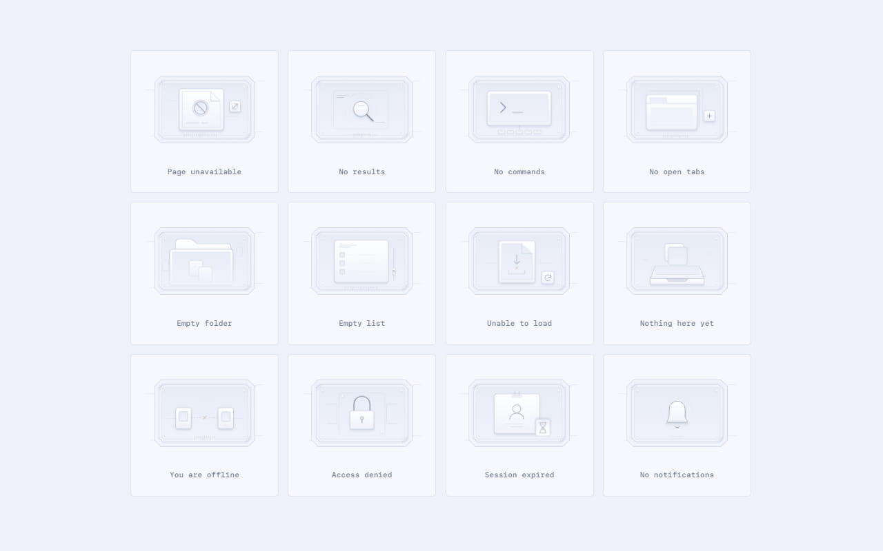
Empty StatesTwelve precision-crafted empty states with porcelain surfaces, recessed panels, chamfered frames and engraved details. Original SVG scenes with layered mechanical animation.
Kubai Empty StatesTwelve miniature product interfaces for empty, unavailable, and failed states. Self-contained SVG with light, dark, and system themes.
Popin PreloaderA pale blue-gray loading screen with a brand-blue sweep, elastic Ready letters, and an upward curtain exit.
Clip Image PreloaderA logo and counter lead into seven clipped photographs, arranged as a responsive montage, then darkened and lifted away.
Step Overlap PreloaderA softly blurred letter entrance and corner counter, followed by white, pale blue, and brand-blue curtains that lift in sequence.
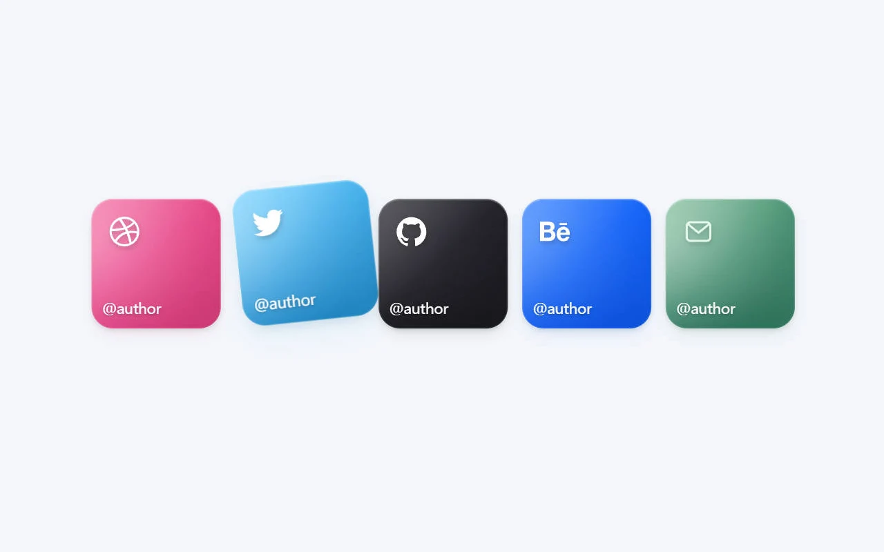
Social CardA stack of social links with luminous gradients, blurred color, and fine grain. Hover or focus to spread the centered cards in both directions; touch devices show an open grid. Includes a standalone HTML version.
ASCII BackgroundBlue ASCII currents drift across light and dark canvases, with ripples that follow your pointer. Available as a React component or a standalone HTML file.